Logo Types and How to use them
What are the most recognizable Logo types and
How can you use them?
A logo can take form of almost infinite variety of shapes and personalities - from literal through symbolic, from word-driven to image-driven.
They’re all a combination of typography and images, and each type of logo gives your brand a different look & feel.
And since your logo is the first thing your audience will see - you want to get it right.
Which type of logo is best for a particular company?
Each type of logo design has its advantages and disadvantages.
Branding is full of different types of logo, but did you know there are actually a few broad categories to consider? This is a great place to start when deciding on your next logo design project as it immediately focuses your mind on exactly what style your design is going to be.
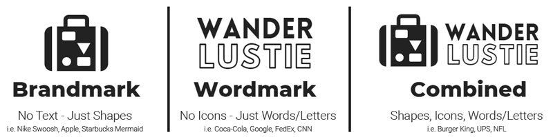
The three basic categories of logo styles are:
"Brandmarks, Wordmarks and Lettermarks, know as "Combined""(to name a few).
This post is going to explain how each category is defined, give you some famous examples and explain when and why they should be used.
It's worth noting that not all logos fit neatly and cleanly into these categories, which isn't a problem. You should see them less as a rigid system and more as a way to get you thinking.
For more advice on logo design, see our Logo Checklist, which lays out the golden points when designing a logo.
Brandmark
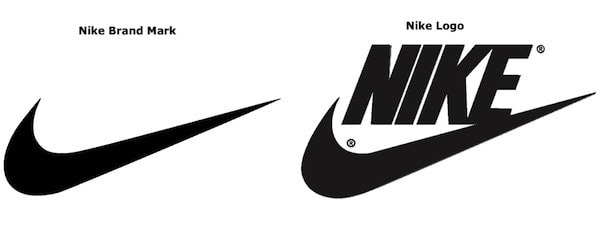
Also known as a pictorial mark, a brandmark contains no text but is an image, icon or symbol that represents the company or brand. Famous examples include the Apple silhouette, the Target bullseye, the Nike ‘Swoosh’, the Red Cross symbol and the WWF panda.
A brandmark can be a great way for audiences to form a psychological connection to your brand, as the brain responds on a deeper, more instinctive level to an image than written text, which needs to be interpreted.
This principle can be seen, for example, in social media, where a symbol like the Twitter bird, the Snapchat ghost or the Instagram camera icon encourages people to share content they’ve encountered on a website almost unthinkingly.
Using only a symbol to explain your brand also has obvious advantages when it comes to serving a global market, as it can (in theory) be instantly understood everywhere in the world. The success of a brandmark, however, does rely on audiences knowing what the symbol means, so it’s a tricky thing to pull off for all but the best-known brands.
Creating an effective brand mark requires creativity, deliberate decisions, and attention to detail. Sometimes, it can be difficult for marketing teams to improve a brand mark to make the image meaningful, recognizable, and easy to understand.
Companies that seek to update or change their brand mark should follow several steps to do it correctly.
- Choose a brand mark that represents you the best. Refining your entire company down into one image can be challenging. However, if you use all the benefits of graphic design correctly, it can work wonders. An appropriate image can quickly change the way customers perceive your brand.
- Make it easy to understand. Customers who will encounter your brand come from different backgrounds and age groups. That's why your brand mark should be easy to recognize and perceive. Your clients shouldn't struggle to figure out the message you were trying to communicate. Keep in mind that nowadays people are overwhelmed with the excessive amount of companies and their marketing efforts. It's crucial to convey your brand idea fast to get the customers' attention and increase brand engagement.
- Create a brand mark that is easy to memorize. One of the goals of creating a powerful mark is to make customers remember your company and choose you over the competitors' alternatives. Developing a suitable and straightforward design ensures that you convey your brand's message clearly and effectively. As a result, customers will easily memorize your company.
- Ensure that it conveys your identity. In the long run, it's advisable to select an image that represents your brand's purpose and mission rather than an image that showcases your goods. You can't exclude the fact that your priorities and your main product might change, or you would like to expand to other types of products in the near future.
- Be consistent. Anything can inspire you to create a great brand mark, from the brand name to depicting what the company does. Let's take John Deere, for example. The brand name inspired the team to create a deer-shaped icon. When you decide on the brand mark, you should ensure that your team uses it consistently when communicating with leads and customers.
- Think timeless. As you know, some things can go out of style quickly. The word "timeless" is used here not to tell about something old or stodgy, it's rather about creating a brand mark that is classic and will never be old-fashioned. For this purpose, avoid using trendy fonts or today's influential design trends. Search for ways to create a brand mark that will be fresh even in 10 years.
Following these several steps enables you to create a brand mark that will stand out and attract customers. Now let's proceed to some examples of brand marks that have succeeded.
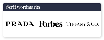
Wordmark
Also known as “logotypes”, wordmarks are purely letter-based and only feature the name of a business. We’re talking no images, icons, or even emblems; wordmark logos are stripped down, sometimes even reduced to initials with 1-3 letters.
However, stripped down doesn’t mean boring! Instead, these logos help to increase brand recognition, and they usually don’t go out of style because they’re timeless and versatile.
In fact, some of the world’s most famous brands use wordmarks. Think Google, Coca-Cola, FedEx.
What’s cool about wordmarks is that they don’t need a million design elements to make them stand out. They’re memorable for their simplicity, and, if designed right, they can be legible on any medium and in any size.
Because of the lack of icons or images, many people worry that wordmarks make for boring logos. We’ll show you why that’s not the case below, but in the meantime, here are a few scenarios in which you should think about using a wordmark to represent your business:
If your business is new. When just introducing yourself to the world, it’s not a bad idea to just tell it like it is with your logo. Starting with a wordmark allows you to build brand recognition, as your audience will come to associate your business with the fonts and colors of your logo. As you become more well-known, you can consider shortening the wordmark to a monogram logo with the same colors and typeface.
If you have a short business name, ideally limited to one word. Once a wordmark gets too lengthy, the design looks cluttered, and it’ll be hard to use your logo on smaller surfaces or screens. In other words, long business names can impact the versatile advantage of a wordmark.
If your business name is distinct. Logos emphasize why your business is unique, but this can prove harder to do without any imagery to reinforce the message. However, a distinct business name will set you apart from competitors, and a wordmark will help it stick in people’s minds.
If you’re not color-shy. While typeface is key with wordmark logos, colors shouldn’t be overlooked. A splash of color can be the difference between a forgettable wordmark and one that people remember. Consider using a classic typeface with a color twist, or go with a contrasting palette to emphasize the name of your business.
Lettermark
Think abbreviations. Lettermarks, or monogram logos, are typography-based logos that take the abbreviated initials of a company and spruce up their design a bit. Boom! You have a no-fuss, no-frills logo.
Advantages of Lettermark logos:
Likely more than ever before, the world loves abbreviations (maybe we have the current technological era to thank for that?).
From our interpersonal communication style – LOL, BTW, OMG – to name a few – to our luxury car companies (BMW), acronyms are throwing themselves all over the modern era.
Also, they’re to the point: Lettermarks turn your lengthy business name into an identifiable brand identity
When to use a Lettermark logo:
It’s relatively easy to get this logo up and running – after all, there’s not much detail to think about – so monograms could be a great option if you’re a new/small business who needs to get their name out there.
Lettermarks are also a good choice for you if you have a long business name – like the New York Yankees – which is difficult to print on small objects or read at a small scale. Finally, because monograms are often associated with personalization and wealth, they can be a good option for brands that are trying to appeal to a high-end crowd or offer homemade/handcrafted items.
What to consider before using a Lettermark logo:
Know your fonts. The simplicity of the logo should work to your advantage, but make sure you’re not stuck with a boring, forgettable logo design; the appeal lies in the details.
Also, you may want to consider embossing your business’s full name under your logo on branding materials (like business cards or a landing page) so that people can build an association between your monogram logo and your company name.
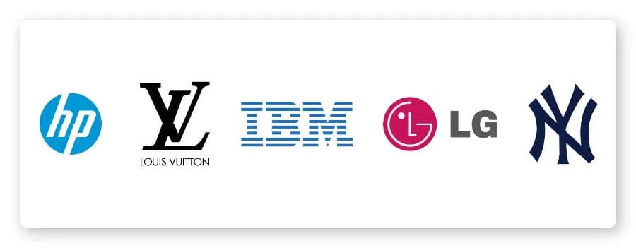
Inspiration: HP, LG, Louis Vuitton, New York Yankees, IBM